■Client: 王力咖啡JASSCAFFE
天慶永開發出中國茶、花果茶、工藝茶三系列茶飲,延續“好茶、好水、精具、佳境”的意象,期許以當代簡約、時尚雅致的風貌,重新詮釋東方茶文化「天人合一」的完美境界。
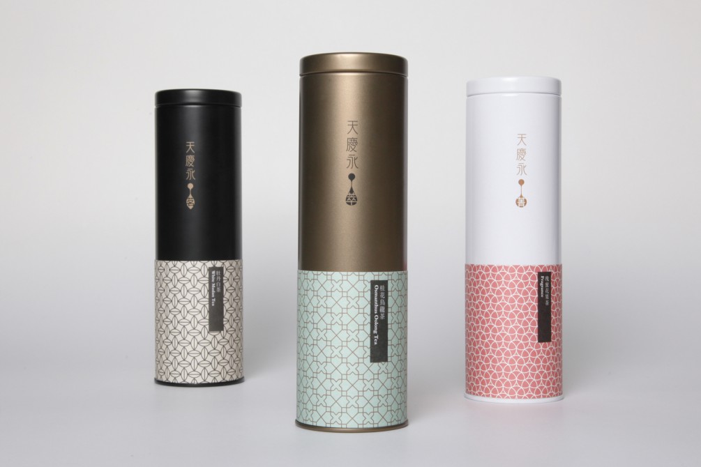
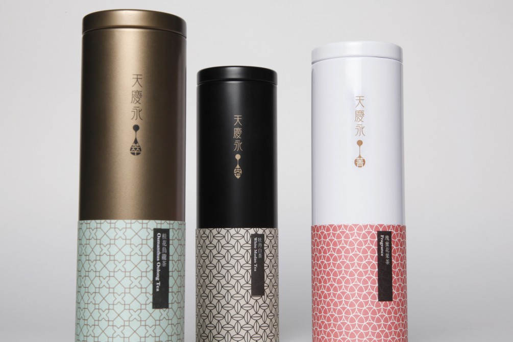
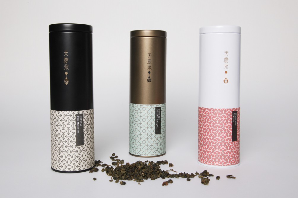
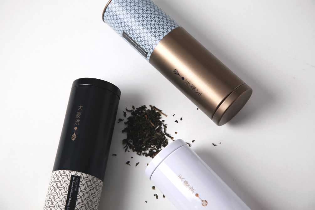
与熊分別以“茗、菁、萃”為系列茶飲命名,以一滴茶湯精華的造型構成icon,搭配3種罐身色彩與圖騰,以最簡約的方式展現不同層次,豐富而優雅。
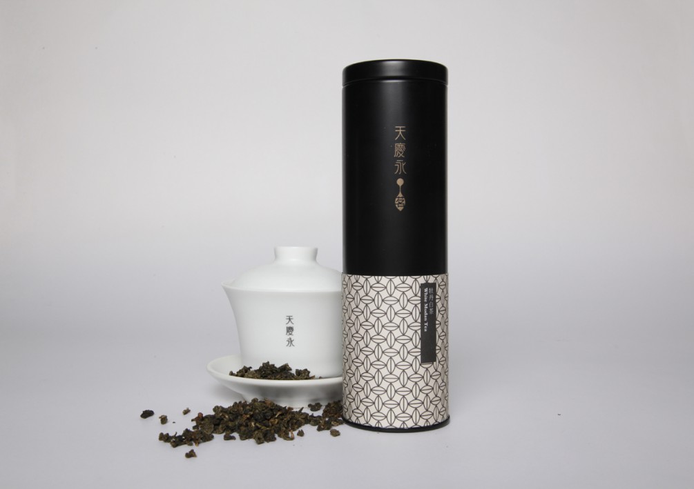
「茗」中國精選茶,以原片茶葉的圖騰、黑色鐵罐詮釋極致完美的品茗體驗。
「菁」精選花果茶,以花果綻放的圖騰、白色鐵罐表現芬芳濃郁之性格,甜韻爽口。
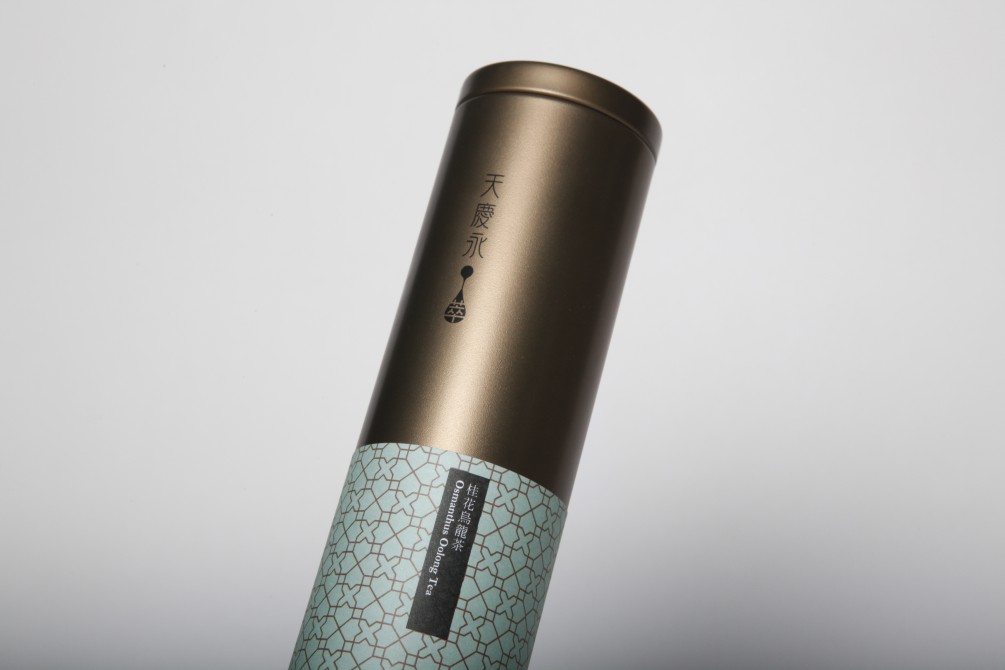
「萃」精選工藝茶,窗花形態的圖騰傳達茶與花的融合,搭配古銅色鐵罐,型塑香醇溫暖的亞洲風味。
“Tian Qing Yong” is a new tea brand.
The brand spirit, “Savoring Nature’s Bounty” puts emphasis on “Great tea and water, refined tools and wonderful state of mind” to help tea drinkers reach a state of serenity and enlightenment as well as physical and mental replenishment. With its modern yet simple, trendy yet refined image, Tian Qing Yong is produced to denote a re-interpretation of the impeccable boundary of “unification of heaven and man” in the Oriental tea culture.
The tea can design of “Ming, Jing, Cui” uses a drop of tea to constitute a shared icon in variations for 3 sub-series/3 related products. The 3 kinds of color schemes and logos on the cans come with complementary logo colors designated for each tea flavor. The rich and refined packaging model sets display and echoes with the family business spirit in this tea brand. (Jas’Rouge, printed on the top of the tea can is the logo of the tea product line under the company.)
The “Ming” tea series is classified as the “Premium Chinese Tea.” As an outcome of inspiration by a blade of tea leaf, the black scheme of icon and logo is an interpretation of the ultimate perfect tea tasting experience. The color scheme for each tea can matches with each original tea color, displaying an overall profound visual effect in presenting the moist and pure flavor of the classic Chinese tea.
The “Jing” series is a selection of herbal tea. The inspiration of the icon used comes from a drop of tea. The logo of “Jing” is a blooming fruit blossom that expresses the fragrant and intense feature flavor of herbal tea. The sweet colors representing each tea flavor go well with the white iron tea can, allowing a visual experience of the refreshing sweet taste of this series of tea.
The ” CUì” series is a selection of Artisanal Tea. The logo of “CUì” is a window pattern that conveys the artisanal tea as a combination of tea and flowers. The bronze iron cans symbolize the characteristics of each product of tea flavor, shaping the gentle fragrance in this Asian flavored tea series.
