■Client: 秋菊皂坊
陳秋菊女士在台東池上國中任職期間,因處理廚餘廢油的機緣,意外開啟她的手工皂人生。
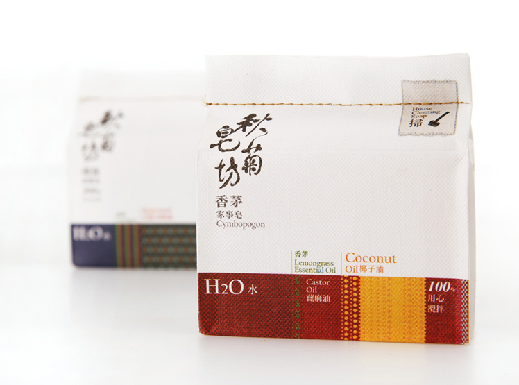
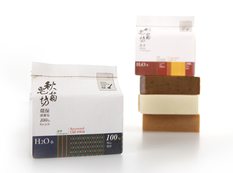
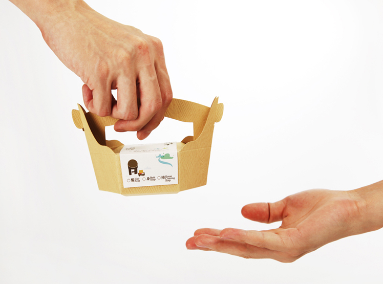
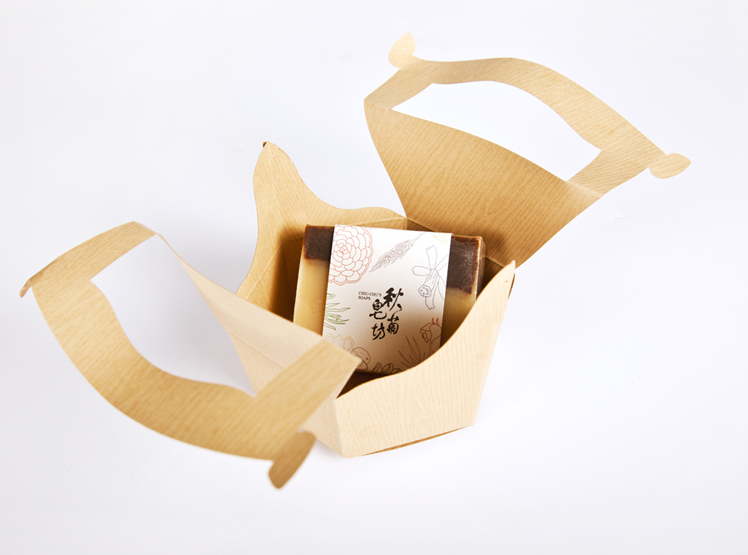
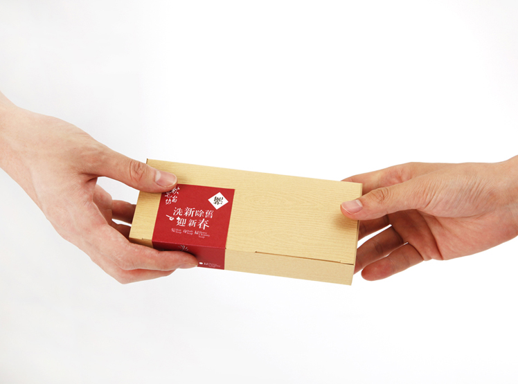
以書法字體作為秋菊皂坊的識別呈現,呈現手工皂的樸質清麗。配方比例以原住民的編織圖紋呈現,表達成分的單純,更發揮了台東的特色,加上車縫線封口讓外觀更具手感的文化性。禮盒包裝採用謝籃的外觀,表達送禮的真心誠意。
When Miss Chen Qiu-Ju was teaching in Chishang High School in Taitung city, she accidentally started her life of handmade soap due to the treatment of waste oil in the kitchen. Qiu-Ju’s hair and skin handmade soap is mostly made up of Taitung’s local materials, while the eco-friendly home soap is made of recycled oil. In 2012, she found problems such as the confusion in brand identification and the lack of packaging plan in many products. Thus, she entrusted Ideoso Design to carry out an overall change of the image.
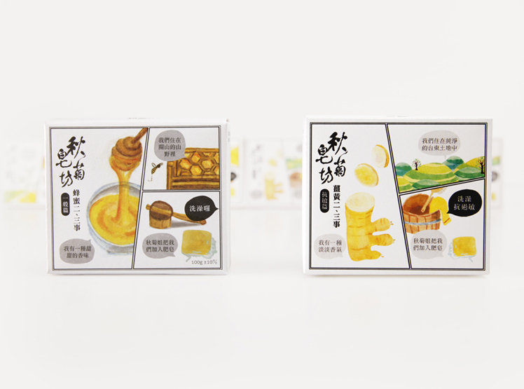
We define Soapohlala (calligraphy) as the main brand identification, matching with the use of the icon of “hair, body, sweep” product lines on the packaging and box. In the design of the packaging of the single soap for hair and skin wash, we present the story and functions of the local special raw materials by using three-cell comics. In the design of the packaging of home use soap, we brought the weaving patterns of the natives in Taitung city into the design, then present the feeling and look of the local culture by sealing it with seam. The packaging of the gift box is the form of wooden basket matching with grain paper wood. It presents the natural overall image of Soapohlala which is located in Chishang.
