編織泰國集團的人本精神
傳統藥廠打造信賴感新形象
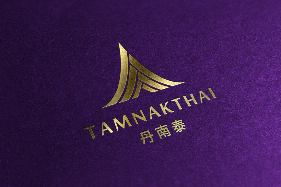
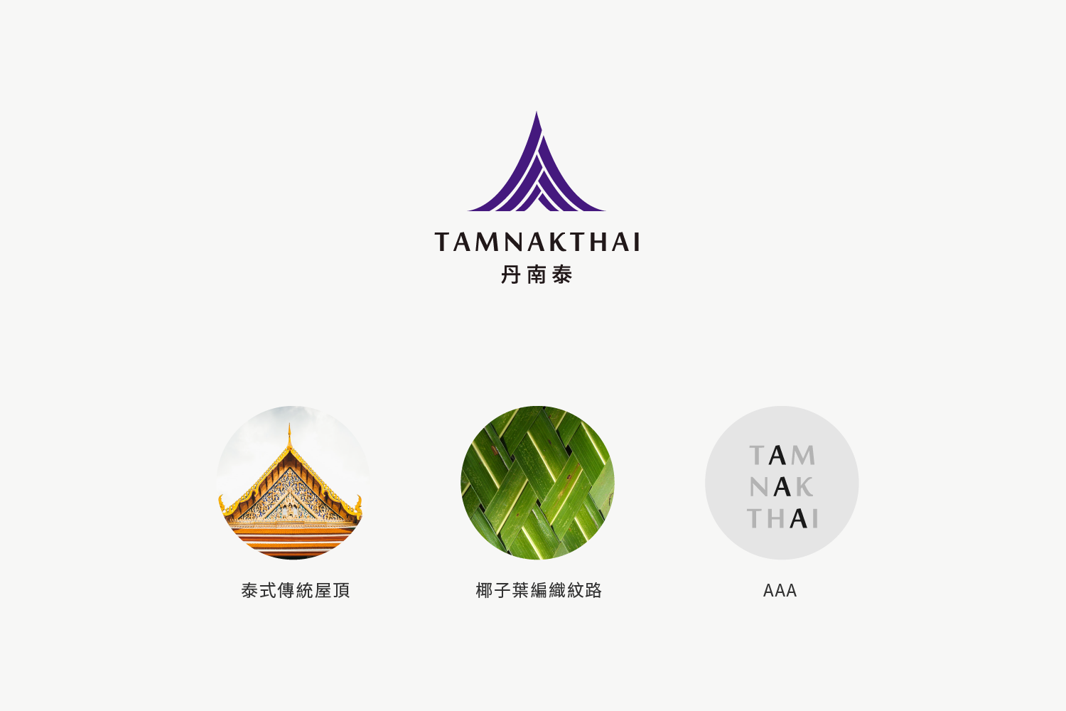
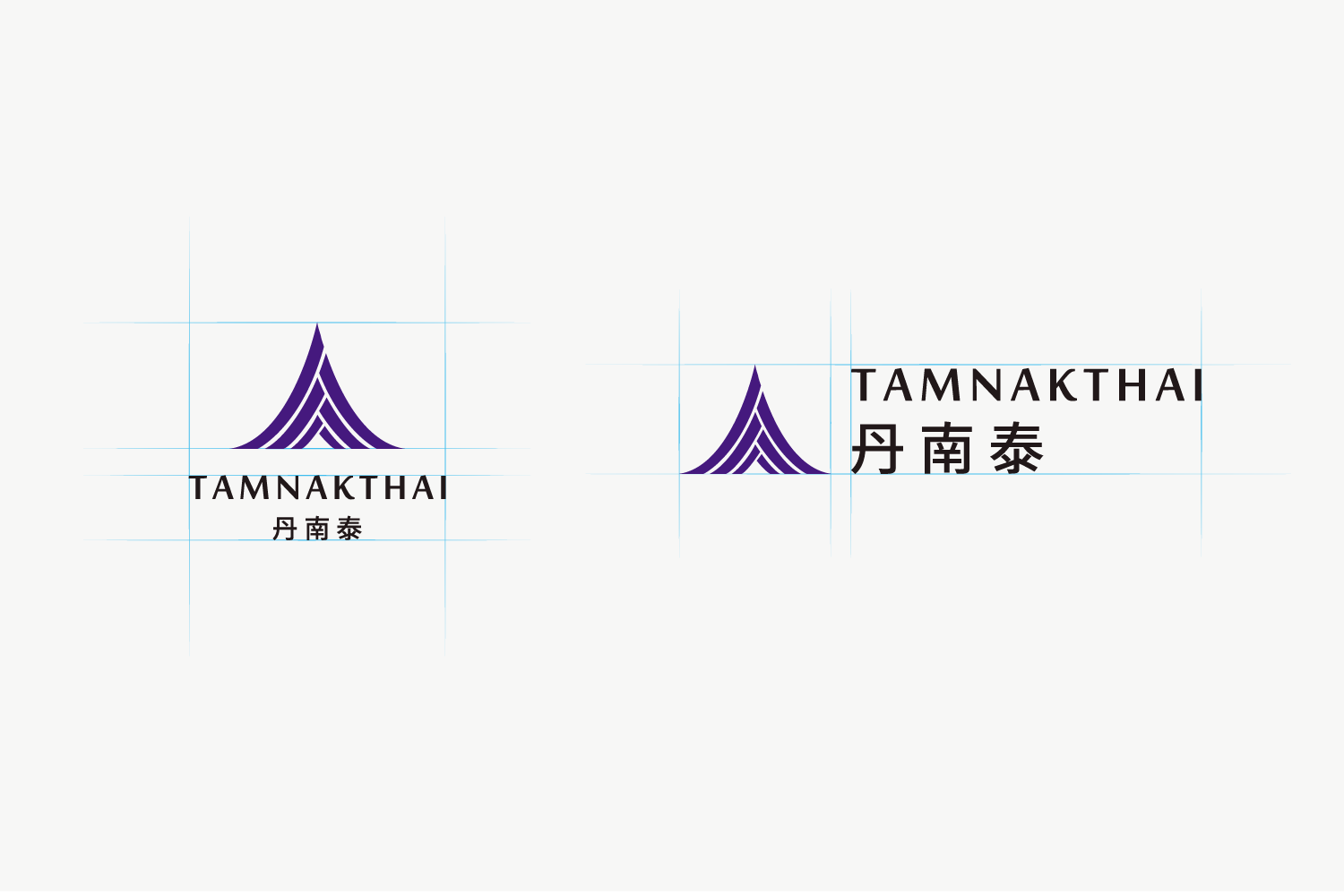
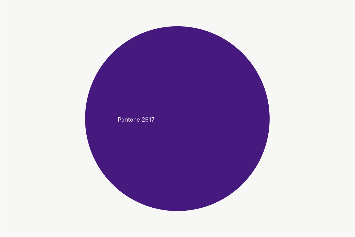
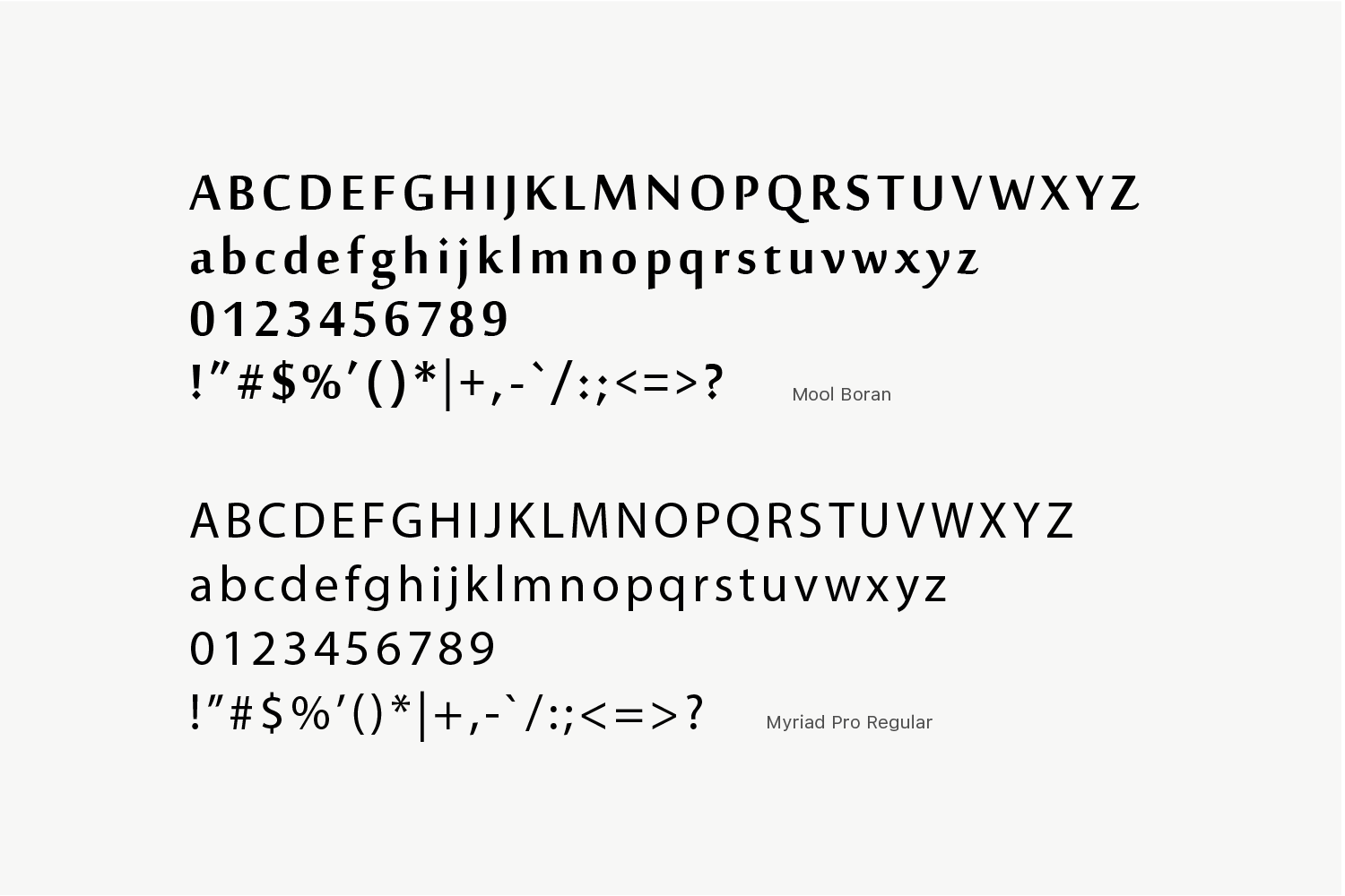
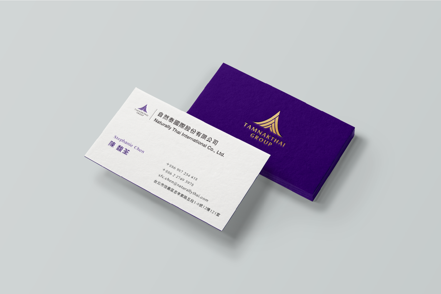
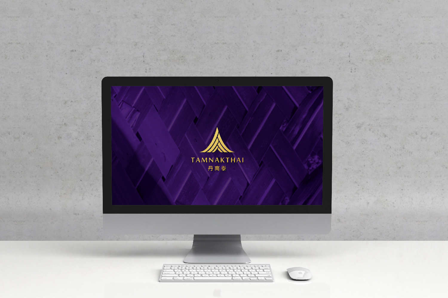
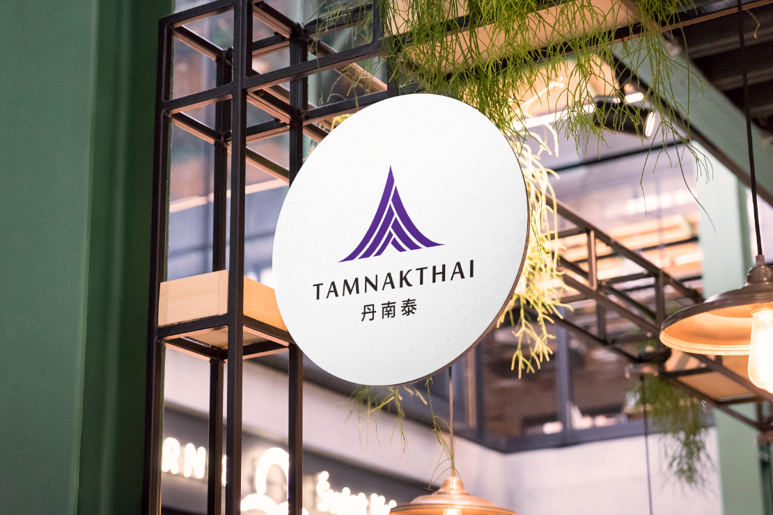
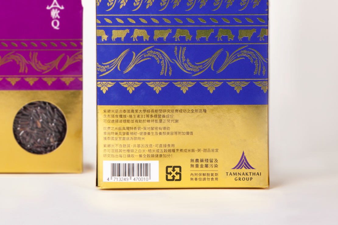
丹南泰來自泰國,關注亞洲人健康的跨國集團,為了统合旗下醫療藥品、健康食品、保健養生三大事業群之企業架構,進行企業識別設計。設計靈感源於泰國傳統建築的屋頂造型、椰葉的編織紋理; 並擷取TAMNAKTHAI名字中的三個A,以「三人成眾」為設計概念,構成三個『人』字堆疊狀,呼應以人為本的企業精神。以沉穩簡約的中英標準字,搭配象徵泰國皇室尊貴的紫色與金色,打造兼具專業、現代與泰國特色的企業識別。
TAMNAKTHAI is a cross-national conglomerate based in Thailand, focusing on Asian health. This project was created based aiming on refreshing the business structure of 3 business groups and to unite its 3 subsidiaries including pharmaceutical, health food and healthcare.
The logo design comes from the shape of the roof of a traditional Thai architecture, featuring the weaving coconut leaves texture ; furthermore, it took the English alphabet “A” which appears thrice to highlight its design concept of “three symbolic elements of this logo, that make a crowd” in the shape of 3 Chinese characters symbolizing “human.” It corresponds to the human-oriented entrepreneurship of the 3 business groups. The logo adopts simple and calm standard fonts for English and Chinese, featuring the royal purple and gold of the Thai royalty to create a modern and professional Thai corporate identity.
