■Client: 王力咖啡JASSCAFFE
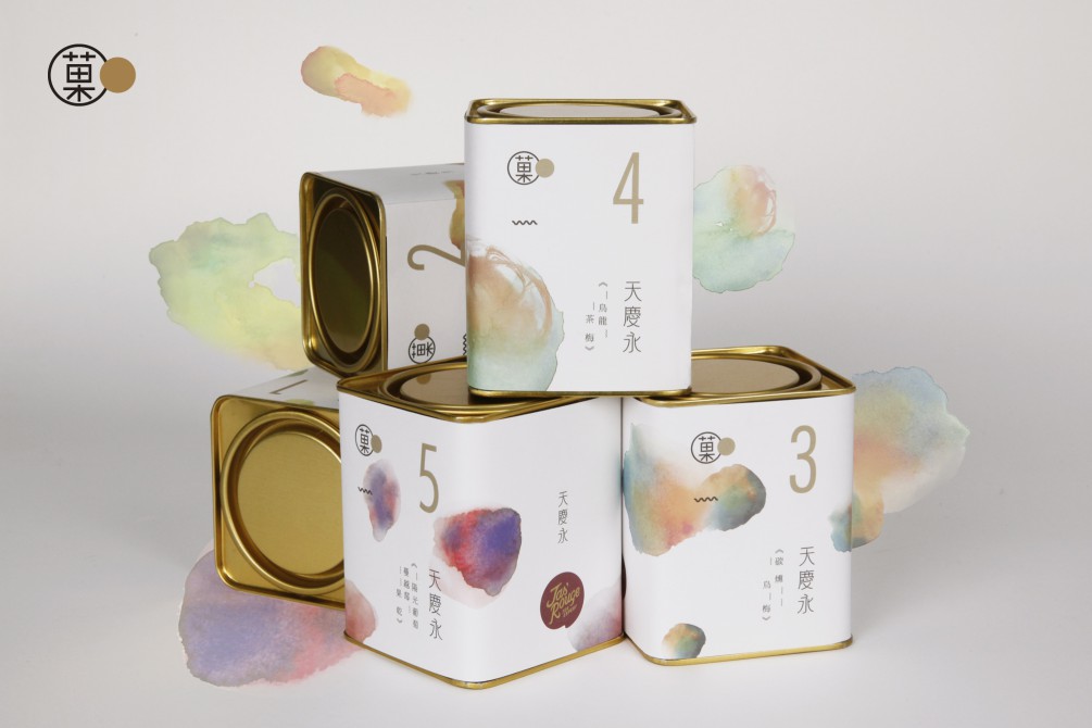
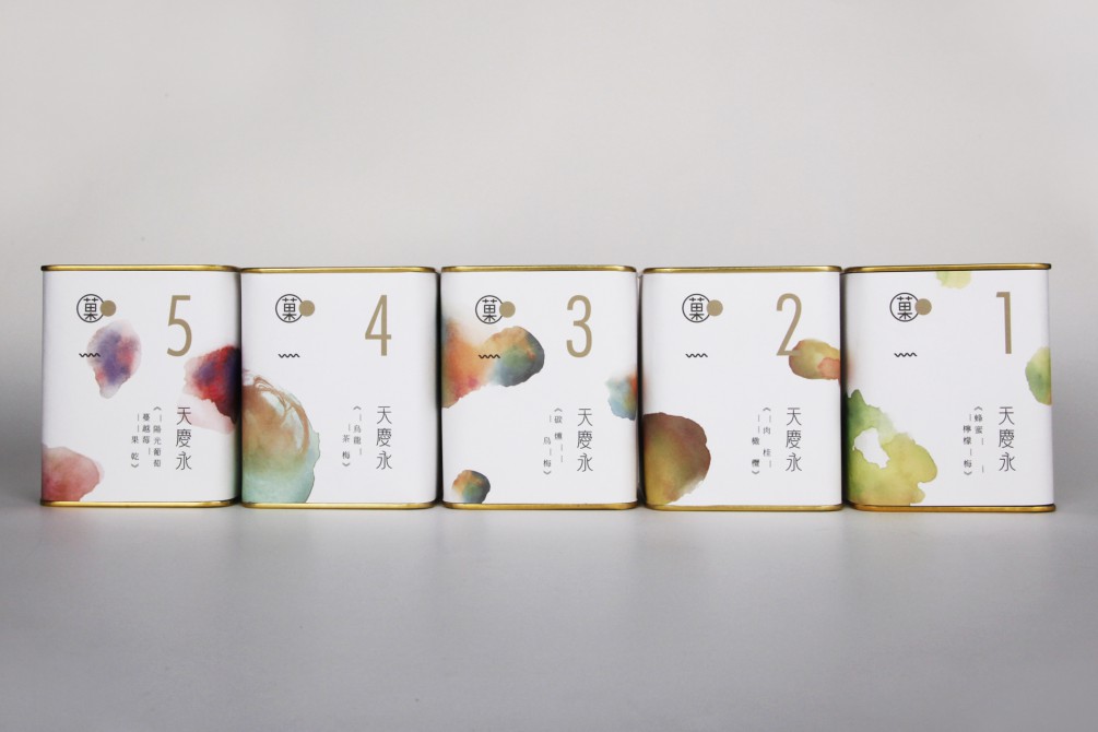
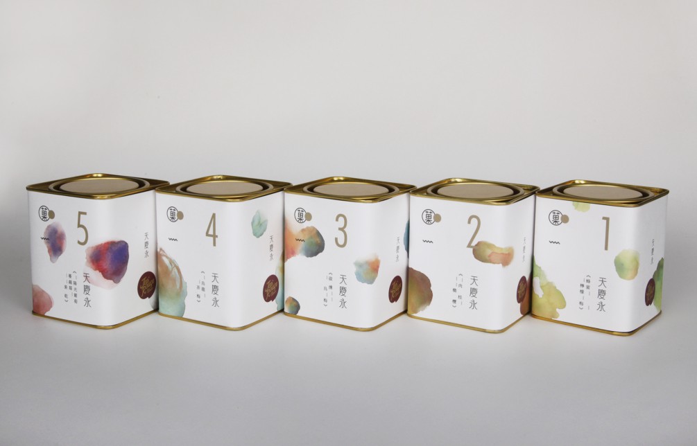
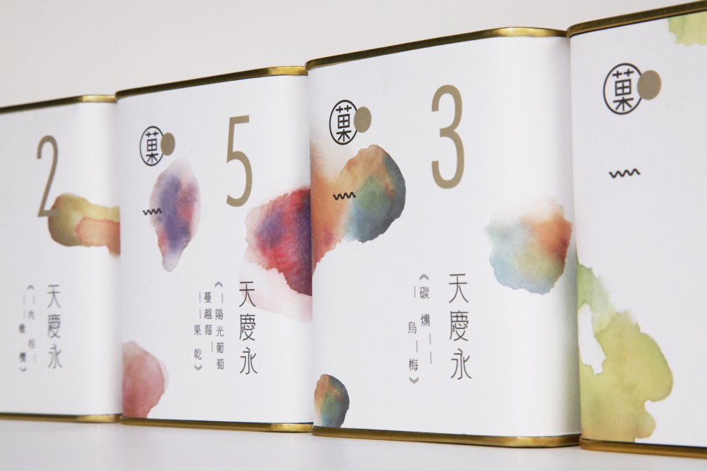
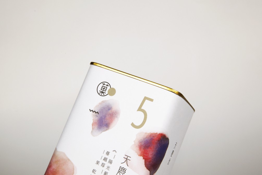
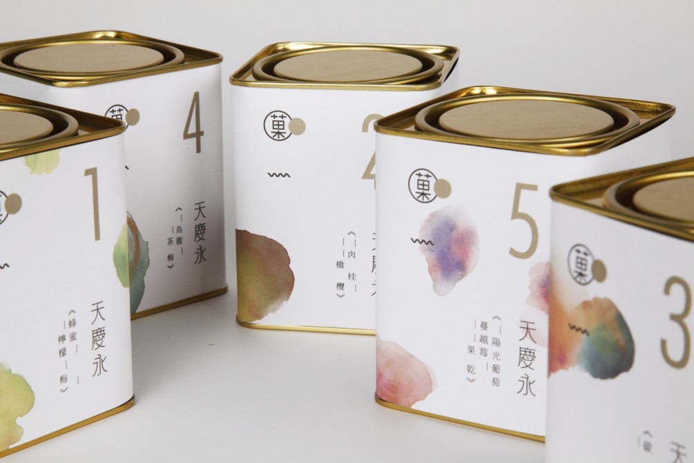
天慶永秉持對茶葉品質的堅持,跨足喝茶佐食的點心,發展出“菓GUO”系列的獨特風味茶食。透過水彩渲染的視覺轉譯,將蜜餞入口產生的酸甜滋味具像化,依食材不同的特質調配出對應的風味色彩,將入口生津、清爽酸甜的視覺印象表現在金色罐身上,表現天慶永當代雅致、現代食尚的品牌風貌。
Tian Qing Yong, insisting on the quality of tea, has extended the tea relish to side-disk desserts and developed the “GUO” series of uniquely flavored tea food made of fine selected natural delicious fruit preserves that bring in long-lasting aftertaste in the mouth, just unforgettable! GUO means Fruit in Chinese.
The golden packaging can symbolizes Tian Qing Yong’s branding style of contemporary elegance and modern food fashion, and through the visual interpretation of the watercolor rendering, the abstract sweet-sour taste emerging from the confiture in the mouth is figuratively presented. Each packaging design reflects the collocated colors featuring the ingredients, and the undulated line that indicates the sour level as well as the number that distinguishes the taste levels of the preserves help consumers from home and abroad easily remember their favorite flavors. The exuberant sweet-sour relish tastes, the packaging visual feast, what an enjoyment!
