■Client: 勤貿實業股份有限公司
不二堂以現代東方美學為基礎,營造符合現代人「內心需求」的「茶體驗」。
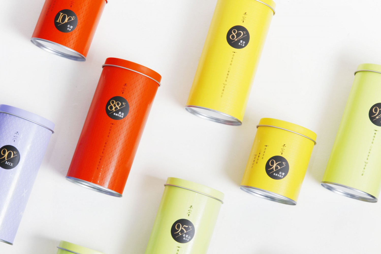
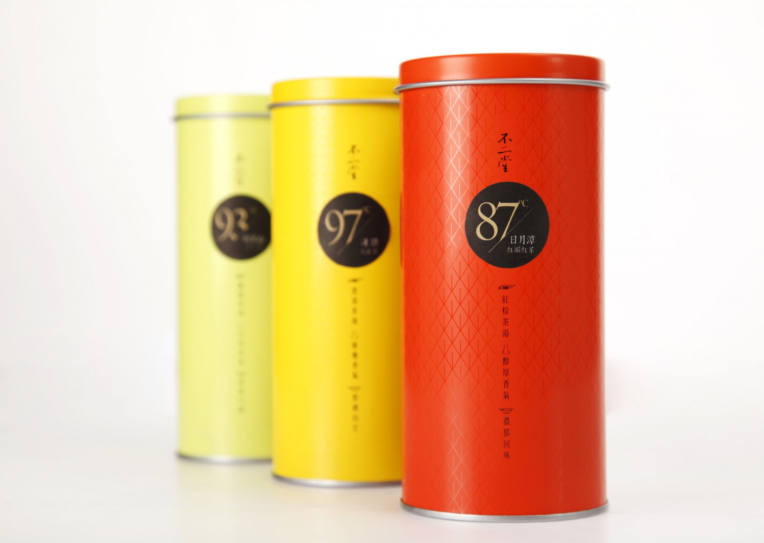
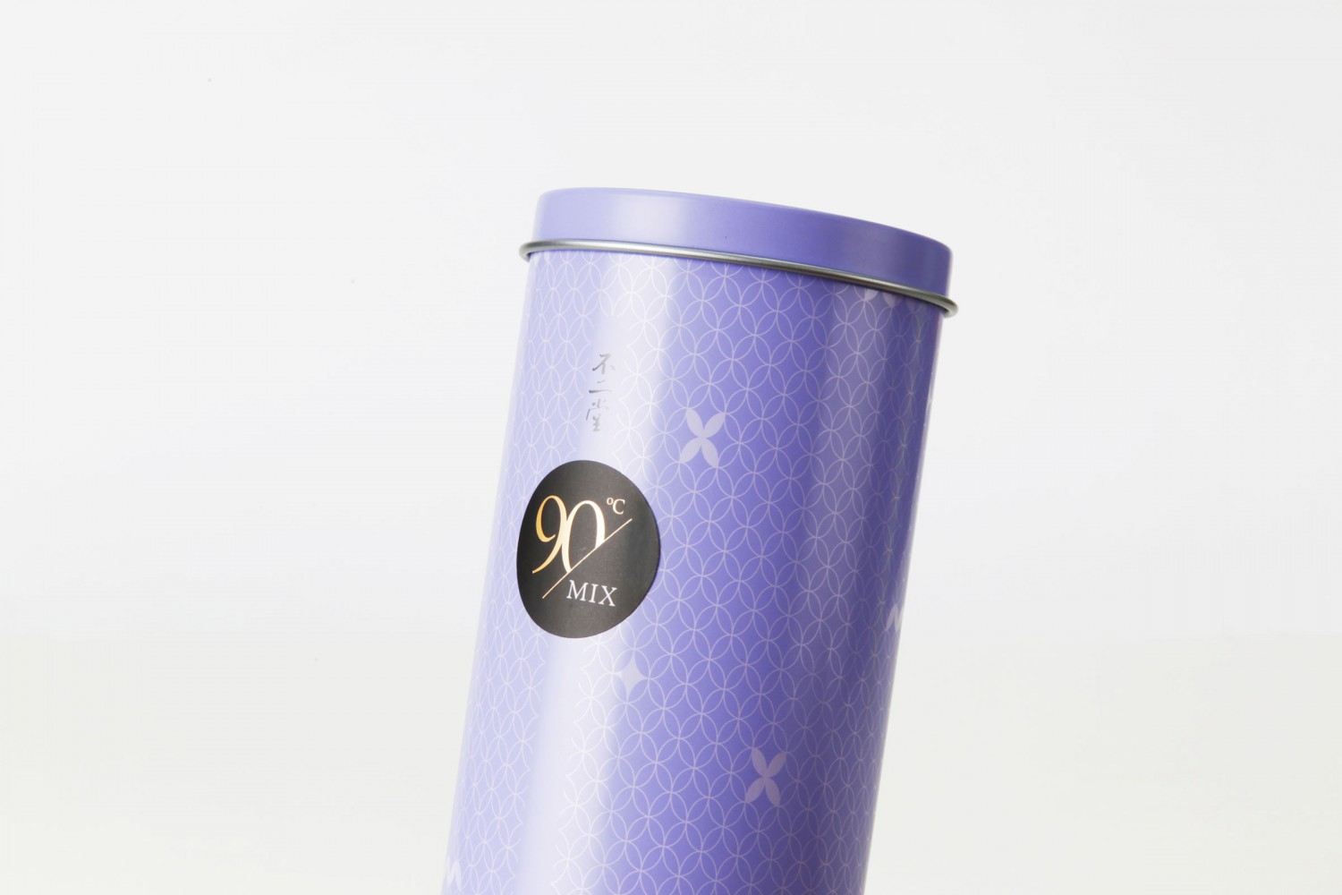
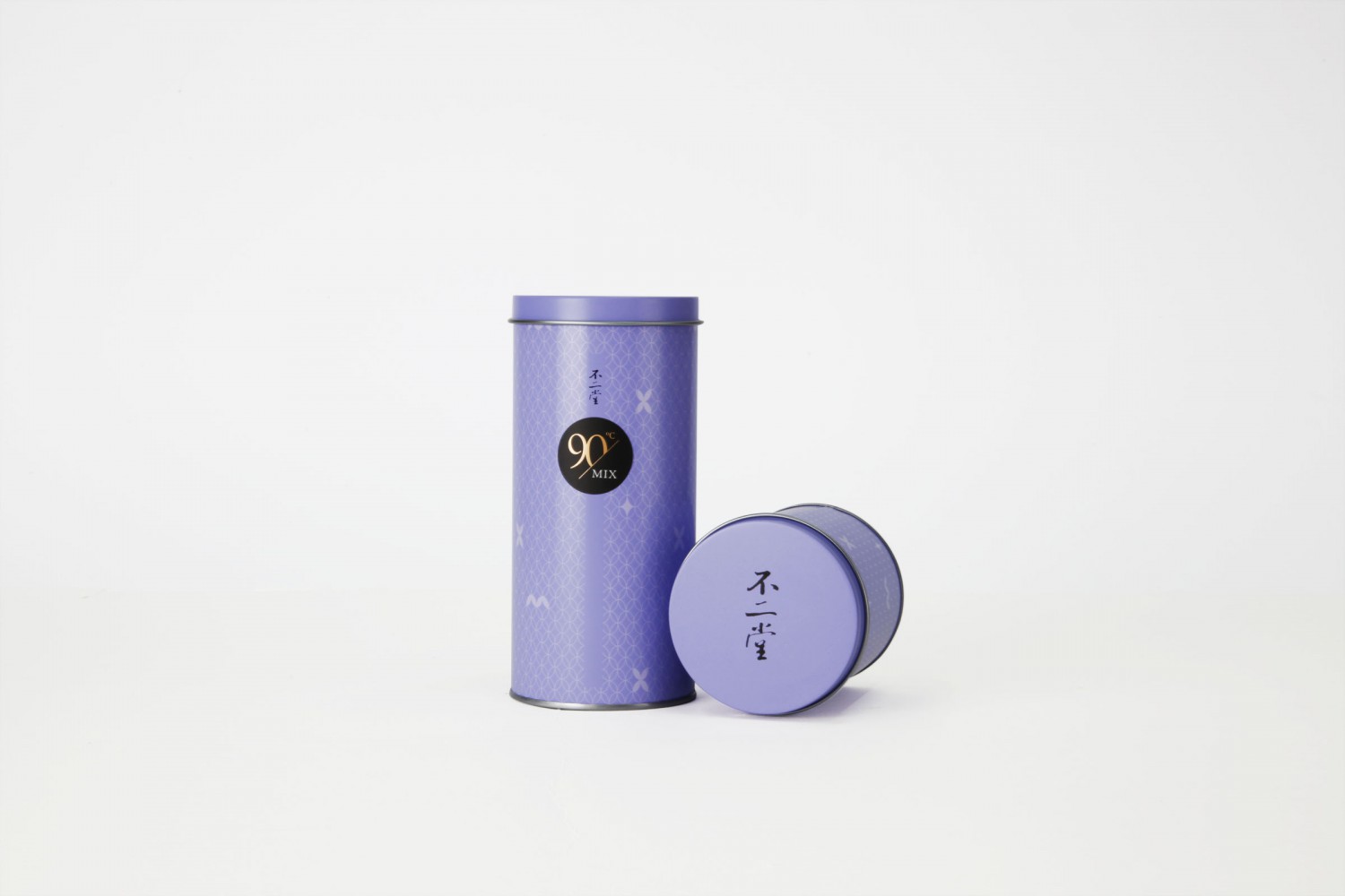
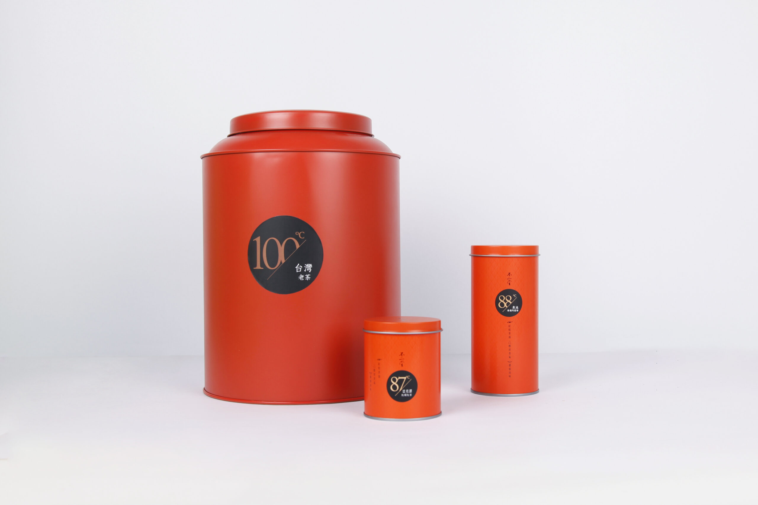
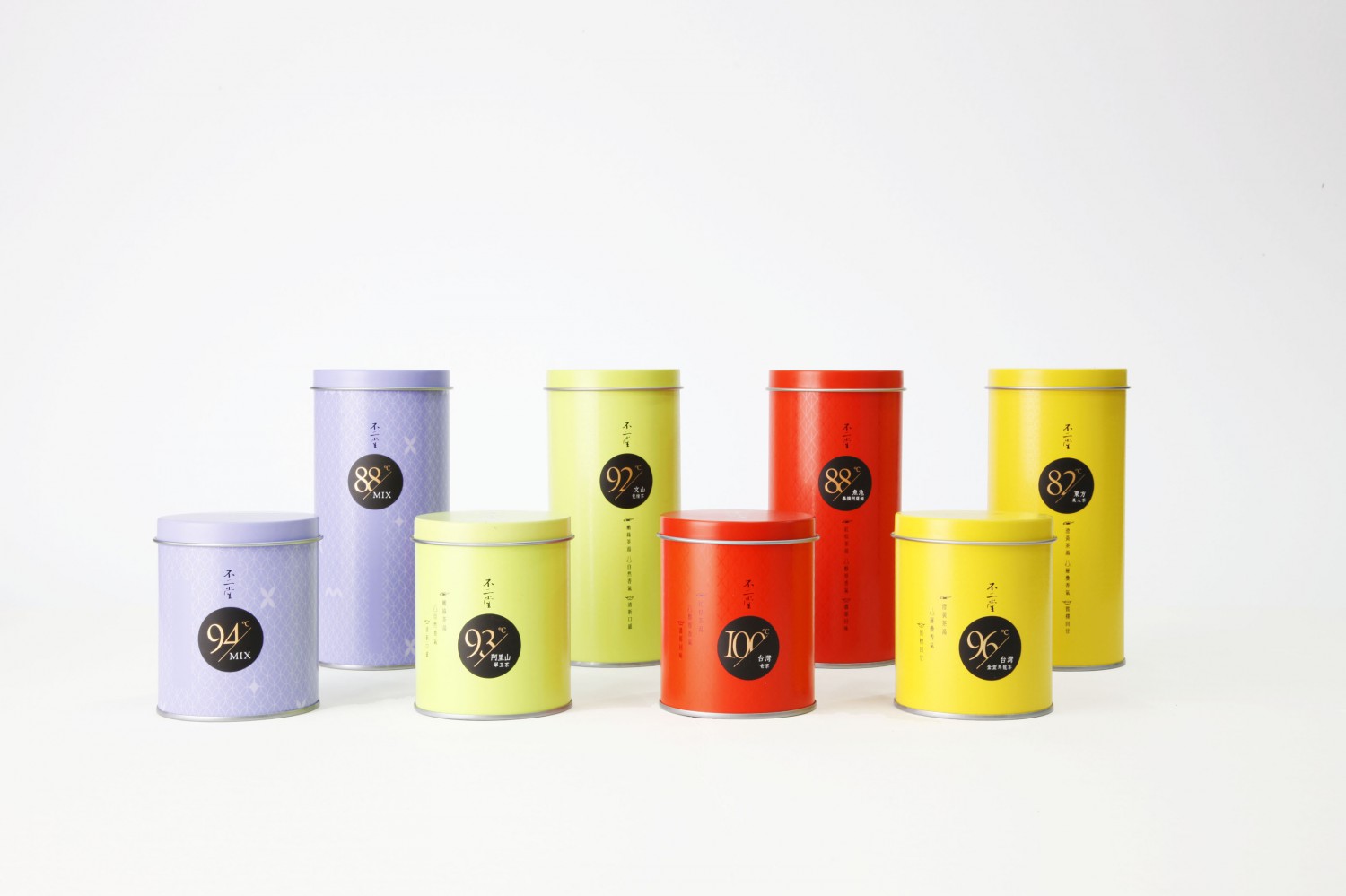
原味茶罐採用綠色、黃色、紅色,對應茶湯輕發酵、半發酵、全發酵茶的色澤,表面以局部上光的方式,細膩的反射出「人、茶、器」的紋路。紫色為「混茶」罐,選色取自對比色的邏輯,原味茶罐的紅與綠為對比色,而黃色與紫色互為對比,讓茶罐陳列更具視覺效果;罐身以茶葉輪廓交疊,構成「MIX」的圖像排列。茶罐搭配最佳沖泡溫度的標示,讓使用者能輕易瞭解每款茶品豐富而獨特的個性。
Bu Er Tang offers “fully devoted, absolute unique” making tea atmosphere. Bu Er Tang has professional knowledge of each characteristic of tea and tea set, and taking modern aesthetics to create a “tea experience” that fit in current environment needs. Hoping people who use the tea set will deliver a cup of good tea to satisfy users’ feeling.
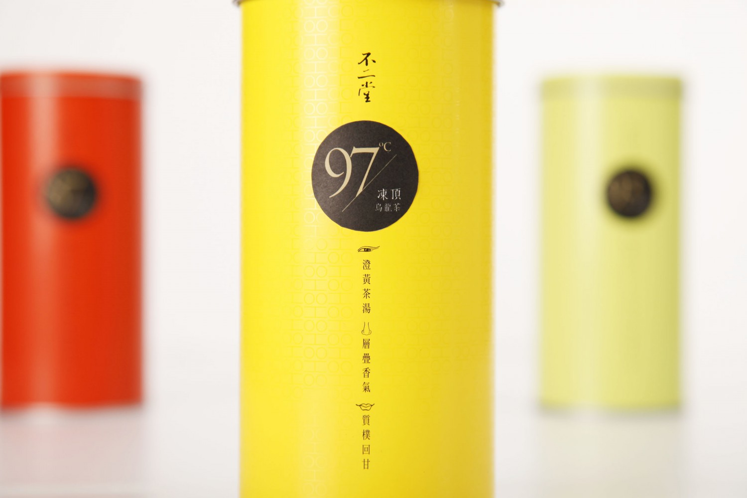
In the design of original favor tea caddy, we carefully give a little bit shine on the Chinese character of tealeaves, tea set, and human over the matte background which fit the concept of Bu Er Tang that they believe “tea leaves, tea set, and human” has tight connection to each other. The color on the tea caddies refers different levels of fermentation which green is non-fermented, yellow is micro-fermented, and red is fully fermented. The tea caddy divides into three different colors with suitable brewing temperature for each categories of tea. On each color of tea caddy, it also describes the sight, smell, and taste that make users easily to understand the characteristic for each category of tea.
Mixed tea is special and customized product in Bu Er Tang. The pattern is using tealeaves shape that interlocking each other to make a pattern. Using the word “MIX” as imagery to blend into tealeaves pattern. The color of purple is taking from contrasting color of yellow from the original favor tea caddy. The benefit of the contrasting color, red and green, yellow and purple is to give more cohesive display. Using purple on the tea caddy is not only a new and modern idea, but also shows the customers’ personality taste and their unique favor. Therefore, this extraordinary color symbolized Bu Er Tang’s brand approach “fully devoted, absolute unique”.
